"PrintAustin: The Contemporary Print" at Big Medium
To go or not to go: That's ultimately a stupid question
Reviewed by Wayne Alan Brenner, Fri., Jan. 24, 2020


Let's talk about what's called "conceptual art," please, if only for a few sentences.
Because sometimes there's something in a gallery, something that's part of a group show or solo show; or it's the sole piece, an entire installation of some kind, commandeering the whole venue. And you look at it, and it doesn't really do much for your sense of pattern or design or color; it doesn't really please or interestingly offend the eye. You know? Your response to its ocular impact is mostly, "WHUT?"
And then there's a separate bit of text accompanying the thing, or the artist is there to explicate what you've been looking at. And, all too often, when you've been made to understand what they were going for, your reaction remains pretty much along the lines of "WHUT?" And you're glad for the artist, that they were able to bring a thing into the world that hadn't been in the world before, and glad (and maybe slightly jealous) of their privilege in having it displayed for public consumption. But you're also left wondering – because the piece's surface hardly seems worth the effort of raising your eyelids for a glimpse of it and its "concept" is ultimately mediocre – why anyone other than an art therapist is supposed to give a shit about it in the first place.
But then there are creations of conceptual art – rare, as ever with everything, per Sturgeon's law – that look like nothing much at all ... but once you're given the key of secondary information, you're sort of stunned, looking at it anew, and you think, "Holy mother of gods, this artist is a fucking genius!"
What's the most rare thing, it seems to me, is when a concept has a sufficient level of depth or even just cleverness and complexity of execution that its rendition will knock you out smiling – and, as if mere lagniappe, it's also visually and/or texturally one of the more fascinating objects your senses have been treated to. You encounter something like that, and you almost weep for the beauty of its existence; you have an acquisitive nature and naught but a journo's salary, and you curse the fates that have relentlessly supplied the wrong numbers on your habitual lottery ticket.
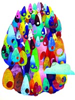
Are you up, citizen, for a bit of your own similar weeping and cursing? Because Sumi Perera's 2B or Not 2B is part of "The Contemporary Print" at Big Medium Gallery, and it's just the creation to make you respond like that. (It's a bit scary, too, that much of what else is on display at Big Medium in the diverse group show curated by Claudia Zapata for PrintAustin is of a similar power and beauty; but we're considering just this piece here.)
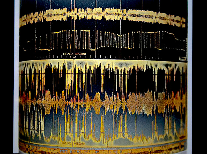
Listen: Perera's piece, a series of prints in book form, was "inspired by sound waves generated by the sound of 2B and non-2B graphite pencil leads writing the phrase 'to be or not to be' on different substrates. These sound waves were re-drawn, using various metalpoint styli: gold, silver, brass, copper, tin, aluminium, zinc, platinum. Other audio recordings ... generated sonic wave patterns ... of different [voicings] of 'to be or not to be' from famous TV sketch comedies and film, poets, and a Congolese interpreter. Pre-etched zinc plates of architectural features, were stripped and recycled to make the wave patterns. The plates were deeply ... etched [and] aquatinted to achieve embossing. These were inked using viscosity methods – both intaglio and relief roll inking – which were then curved to simulate wave patterns and placed upon a rolled gradient of color. Electroconductive ink channels run on the paper and connect to a control pad programmed with 12 tracks of 'to be or not to be' interpretations."
Mind feeling blown yet, reader? But you've gained this information because you chose to read it here. Your reviewer learned it because such was the complexly compelling beauty of Perera's industry's result (the thing itself, beyond context) that his curiosity was piqued to the point of mania: What's behind this controlled explosion of visual brilliance into our too-often humdrum world? And so he helplessly sought the answer in the show's catalog. Helplessly, I say, because you look at 2B or Not 2B and, never mind Hamlet's feigned madness or ghostly father, you want to somehow wear the piece as raiment if you're ever called to attend the court of the King in Yellow. Because it's certain that His Xanthic Majesty would note your adornment and command that, as sure as tears unshed shall dry and die in lost Carcosa, no harm may e'er befall the wearer of such a divine work.
Or, to repeat more simply, and especially after having looked further into Perera's career thus far: "Holy mother of gods, this artist is a fucking genius!"
“PrintAustin: The Contemporary Print”
Big Medium Gallery, 916 Springdale, Bldg. 2 #101, 512/939-6665www.bigmedium.org
Through Feb. 15